Nope, this is not getting the title of an “App I Love”… though it’s not bad. Keep reading to find out why – you’ll learn a lot of best practices for to-do lists and productivity in the process.
Whether you’re a long time reader or not, you probably know that I absolutely love making lists… especially to-do lists. (If you haven’t already, check out my two-part post of how I organize my to-do list to GSD.) I created that Excel template in part because it was easy for me to work with, but also in part because I hadn’t yet found a to-do list app on the market that had the capabilities I wanted. Namely:
- Ability to keep multiple lists with different time horizons (today, next week, next month, long term)
- Ability to easily move things from one list to the other
- Ability to include plenty of notes on the task
- Ability to sort/filter by category or by specific tag
- Ability to store the entire document in the cloud and be able to access it from multiple devices running different OS
But a few weeks ago, I heard about an app called Clever To-Do that is based on the GTD methodology and seemed to have all those abilities… so I decided to give the free version a try. Clever To-Do is available for the Windows Phone API, but they also have a web API that can be accessed from any device. So even if you don’t have a Windows 8 device that has the official Clever To-Do app, you can access your lists from anywhere using the web interface. Unlike some other web interfaces that actually were so limited that I could pretty much only use the app, I found that Clever To-Do worked just fine on my tablet and computer. Hooray for that!
The Clever To-Do app costs $1.99 at the Windows Phone store, but I really liked what they did to make their trial version. You get all the same features as the full version, but whenever you open the app, you have a waiting screen that counts down and encourages you to buy.
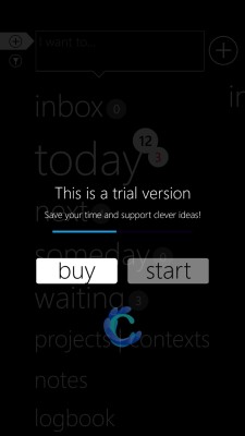
To me, that type of trial is perfect – it’s still usable when you have the trial version, but it’s definitely incentive to buy the full version. To be clear, I did not purchase the app – I wanted to decide if I would use it permanently before paying money. In the end, my answer was unfortunately that no, I will not be using this permanently 🙁
When the app starts, you’re on a basic home screen that lists different categories, or “Contexts” in Clever To-Do parlance. You can assign tasks to “Today,” “Next,” “Someday,” and “Waiting” by choosing from a drop down in the popup when creating a new task or editing an existing task. These were great categories and pretty close to what I already use, but it should be noted that they are static and not at all customizable.
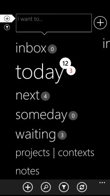
I really liked the concept of the “Waiting” Context, whereas I had previously just put things in my “This Month” or Long Term” lists and added a “Waiting” tag to them. There were also fields for “Start” and “Due” (both of which were calendar fields that also have a timestamp). One of the coolest features of Clever To-Do is that when you reach the date on which you’re supposed to start something or have something due (you can fill out one field, both, or neither), it automatically moves the task from whatever list it was on up to the “Today” list. (Just make sure the time is set to 0:00 not the default of 12:00 – I was confused why some tasks weren’t moving until I saw that I had made that mistake!) This auto-prioritization was by far my favorite feature of Clever To-Do, because it meant that I didn’t have to move nearly as many tasks around at the start of each day, and I didn’t have to spend much time sorting through the non-Today sheets, as long as I had accurately date stamped a task to begin with.
Like my basic Excel version, you can type tasks in pretty easily – just click the plus sign and a popup appears (in the same browser window) with all the potential fields. Note that all of them are optional, so you don’t need to fill out every single one! And if you are creating tasks on the fly, they go into “Inbox” by default, so you can quickly add a task and then add more notes and prioritize it later. Now that is how an inbox should work – things just go in briefly and then are moved to their appropriate place in line.
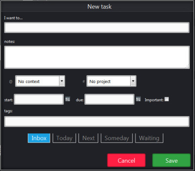
To move a task from one view to another, you would single-click the task to edit, and be taken back to that same popup view, where you could click the tab on the bottom to change its categorization. I liked that a task couldn’t be in more than one sheet at a time (vs sometimes when I’m copy/pasting in my Excel to-do, I screw up and put it in two places). I also loved that when you check the box to mark a task as done, it goes into a “logbook” category so that you have a list of tasks you’ve completed. This could be really helpful if you wanted to look back at your tasks at the end of the week (perhaps to send a quick status update to your boss?). However, the feature is really diluted because it doesn’t save when you marked it as complete – which I think would be the critical feature for any Quantified Selfers wanting to make use of the data. There also was no way to mass-edit tasks, which was kind of a bummer – you had to modify each one individually. That was frustrating if you have a group of tasks that all go together!
As previously mentioned, you can add a context (which is what I used “Type” for in my spreadsheet) or project or both, and then your to-do list can be sorted by those fields. I liked the sort feature a lot, and I also appreciated that you could search all tasks for something – those are things that my Excel does that I haven’t seen in a lot of other to-do list apps, even though they are so useful.
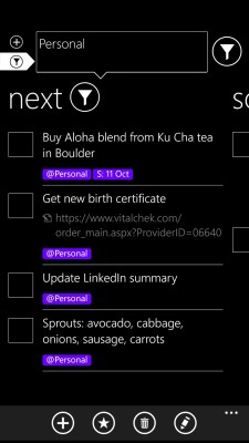
It took me a little while to figure out how to populate the list of contexts, since you have to have them already set before being able to select them in the drop down, but in the web app, you just click on the “plus” sign next to the Project/Context header in the main sidebar list, and then add them. I really liked being able to standardize these, and then the “tag” field was helpful if I wanted to add anything else on the fly that would be helpful in sorting later.
Unfortunately, for me, the negatives outweighed the positives of this. First, I really didn’t like the overall look and feel of Clever To-Do. The font was really big, which meant that I had to scroll a lot in order to look through any of my lists. (And as far as I could tell, there was no way to change it.) Initially I thought maybe it was just a matter of getting used to the interface – kind of like how when you get a new computer or phone operating system, you have to adjust. But it’s been a few weeks and I still just feel like I don’t have as much visibility into my task lists as I did with my old system.
I also don’t like that the notes field is limited in character length – I discovered this when trying to paste the text of an email that I had already drafted but wanted to send later. (Using my company email, so I couldn’t Boomerang it in Gmail.) It truncated about half the text, without any kind of warning! Luckily, I noticed that it left off mid-sentence, and so saved the drafted email on my desktop instead. But for me, that is a big feature miss to not be able to have as much text as I want in the notes field.
Finally, one really weird bug: on the web interface (not the phone app), the dates show up in Polish, no matter how much I tried to mess with the date display settings. (It lets you choose between dd.mm.yyyy, mm/dd/yyyy, etc, but I got an error whenever I selected one and tried to save.) On the plus side, I learned that October is abbreviated “paź” (full name: Październik) and September is “wrz” (full name: Wrzesień). On the minus side, I forgot the name and abbreviation for September just a few days into October (and I never knew how to pronounce it)… so that vocab lesson didn’t really work 🙂 More importantly, I tried emailing the dev team to let them know about this bug, and didn’t receive any reply to my inquiry. Non-responsive fail! I am always really reluctant to use apps that don’t have any kind of support because it means that if there are any changes to the OS, it might just suddenly stop working.
And speaking of which, while out and about I discovered a really major flaw: the app does not sync automatically to the cloud! The phone stores only a local version until you manually go in and refresh it – which isn’t that intuitive. It then brings up a list of conflicts, asking you to pick which one to save. I really like that… except it didn’t work, and when I clicked the button to “use this version,” nothing happened and the conflict remained. Buggy! But the lack of synchronization just really kills it for me – staying in sync is the most basic and most important thing I expect from my to-do list, and Clever To-Do doesn’t do it for me. It makes me really sad, because it’s an awesome base for an app – I just need an actual dev team to fix those bugs! So much promise as far as functionality, but so much missed in the execution.
Although I do like some of the features of Clever To-Do, the interface itself is just a big no for me. It’s not pretty to look at, and it doesn’t let me easily scan through all my tasks in one glance – in part because of that darn huge font. Those are critical features for me for a to-do list! I think I am going to retire Clever To-Do for my own to-do list, and instead consider building a few of them into my Google Drive spreadsheets (e.g., using conditional formatting to highlight tasks that are coming due). Unless someone can recommend another app that delivers on the functionality where Clever To-Do missed? I’m all ears!
Disclaimer: I have no affiliation with the devs behind Clever To-Do (but wish I did so they would respond to my questions). This review is completely unsponsored, but represents the same honest opinions I use in my sponsored posts.

I’m a new reader and am thoroughly enjoying your blog. I am an organization junkie! I highly recommend Any.Do. It has a website, a Google Chrome extension, and iPhone/Android app. All are very simple to use and sync seamlessly. It has various time-based categories (today, tomorrow, upcoming, and someday) with a Notes field for each task. You can also add folders and subtasks. Completed tasks fade to gray and you can remove them from the view by shaking your phone lightly.
My favorite feature is that you can set an alarm for tasks so you automatically get notified on your phone or computer when something is due. Best of all, the app is free! I have no affiliations with Any.Do – I just have used it for a few months and love the interface.
Em, thank you so much for the recommendation! I feel like I tried Any.Do but it was a VERY brief trial and I’m not sure I gave it a fair shot. I am going to check it out again!
I am a huge to-list maker. It just help me organize all the things in my brain. I would agree that being able to see your whole list is crucial for me as well.
You can definitely scroll to see everything, but I miss having them in a small enough font / with tight enough spacing to see it all at once.
I’m always looking for a new to do app! I was so mad when Yahoo bought Astrid and killed her. WTF was the point of that, Yahoo!?
I use Wunderlist, but I’m not convinced it’s as good as Astrid.
Hmm I may need to check out Wunderlist too… I think that’s another one that I tried briefly but not long enough!